
Project Overview
Shuttr is a marketplace that connects influencers and businesses to freelance videographers, photographers and editors. Customers are able to search, view, book and pay freelancers all on Shuttr - hence making it easy to assemble your team and bring your creative vision to life.


Project: Shutter Website Design
Client: Shuttr
Role: Lead UI Designer and Researcher
Platform: Website
Timeframe: 3 weeks
Tools: Sketch App, Photoshop, Illustrator, InVision, Pen & Paper, Sharpie & Whiteboard, Google Slide

Challenge
What might a content creation ecosystem look like that is secure and productive while creating compelling content for the user?
Solution
Design an application that creates connections consisting of trust and quality between influencers and content producers, an ecosystem that produces compelling content which engages their followers.
1. Research
Heuristic Evaluation, Comparative & Competitive analysis, Online Surveys and Interviews.
User Persona, User Observation, Contextual Inquiry.

Current Website Design


We conducted our own “heuristic walk-through” in which we found navigation confusing. Such as, the homepage doesn’t have a search function, which should be the most critical feature for Shuttr. Also, no way to get back to the landing page, and elements that weren’t spaced out enough.

Heuristic Insight:
We also discovered that “the map function gave a sense that a freelancers personal location was being revealed”. In turn, possibly causing a safety concern.
Identify the problems
In order to evaluate the usability and versatility of the website, we utilized the below classifications:

Our heuristic evaluation helped us determine the current pain points in the Shuttr website, such as:
inconsistencies in the style guide and layout.
A non intuitive search function for finding freelancers
Minimal branding overall.
Understand the market

To further understand what has been done, and to analyze what our competitors are offering in the market, we created a C&C Analysis to gathered information that would give us an overview on the features that lent itself to a content creation ecosystem.
C&C Findings:
Most competitors had familiar features such as search and login functions on the homepage making them accessible, whereas Shuttr did not.
Other similar sites had the functionality of chat.
Currently Shuttrs rating/review system could use improvement, as you can see in our initial overview we didn't even see it. Similar sites have strong systems that create a sense of security.
Surveys and Interviews

Through the combination of surveys and interviews we identified demographics for Shuttr. We also identified pain points and goals that both content creators and influencers encounter.
Most influencers were female and between the ages of 18-24
A quote from one of the freelancers stated “My goal is to deliver the needs and wants of clients but still retain my aesthetic.”
Affinity Mapping
We used affinity mapping to identify trends within the pain points, insights, and needs that were gathered from our interviews.
Pain points included:
Lack of communication and trustworthiness
Insight: We explored the concept of having a membership based system where photographers had the ability to pay for their portfolios to get features but we found out through research, that those who have paid for that feature in the past have had a negative experience.


2. Synthesis
User Persona, Feature Prioritization, Design Studio.

Introducing to Our User Personas

So why 2 personas?
We wanted to design this website for both influencers and freelancers. So we found it necessary to put together 2 user personas that embody the expectations, motivations and the concerns of both types of users. If our design was meeting the goals of our personas then we knew we were on the right track.
Persona 1.

Persona 2.

Feature Prioritization

We then used the MoSCoW Method to prioritize the features needed in order for our Personas to achieve their goals. Here we categorized feature by Must Have, Should Have, Could Have, and Wont Have. Some of the must haves for the website were:
Search functions
Notifications
Messaging systems
Design Studio


With goals in mind and features prioritized, we conducted a design studio where we collaborated ideas in order to come up with a layout for the website.
We designed our very rough first drafts of wireframes. Pages including:
Landing page, Search result page, User profile page and a messaging(dm) page.

3. Prototype
Paper prototype, Mid-fidelity Prototype, Iteration, Style Guide, High-fidelity Prototype.

Paper Prototype
From the layout that we came up with in the design studio, we created paper prototypes which we used for the 1st round of usability testing.

Click on thumbnail to view video.
2 major insights were discovered during this phase was that The homepage and the profile were cluttered and overwhelmed the user. So we iterated by removing some elements to streamline the process.
Secondly, Freelancers feel the calendar on their profile felt a bit invasive, as it was showing their complete/open schedule. We solved this problem by removing the calendar since both users needs could be achieved just as well without it.
Mid-Fidelity Prototype
Persona 1 User Flow

Persona 2 User Flow

With those iterations in mind we were confident to move on to a medium fidelity prototype.
focusing more on sizing and layout.
We continued testing for both an influencer flow and the photographer flow, both which revealed more insights and iterations.
Style Guide
For our style guide, we wanted to create a useful yet beautiful, innovative look for Shuttr’s new website design.
Our mood board illustrates a colorful, versatile, and fashion forward lifestyle that fit into our target market needs. We want Shuttr to be not only a secure marketing community but also a new innovative platform for millennial creatives and customers.
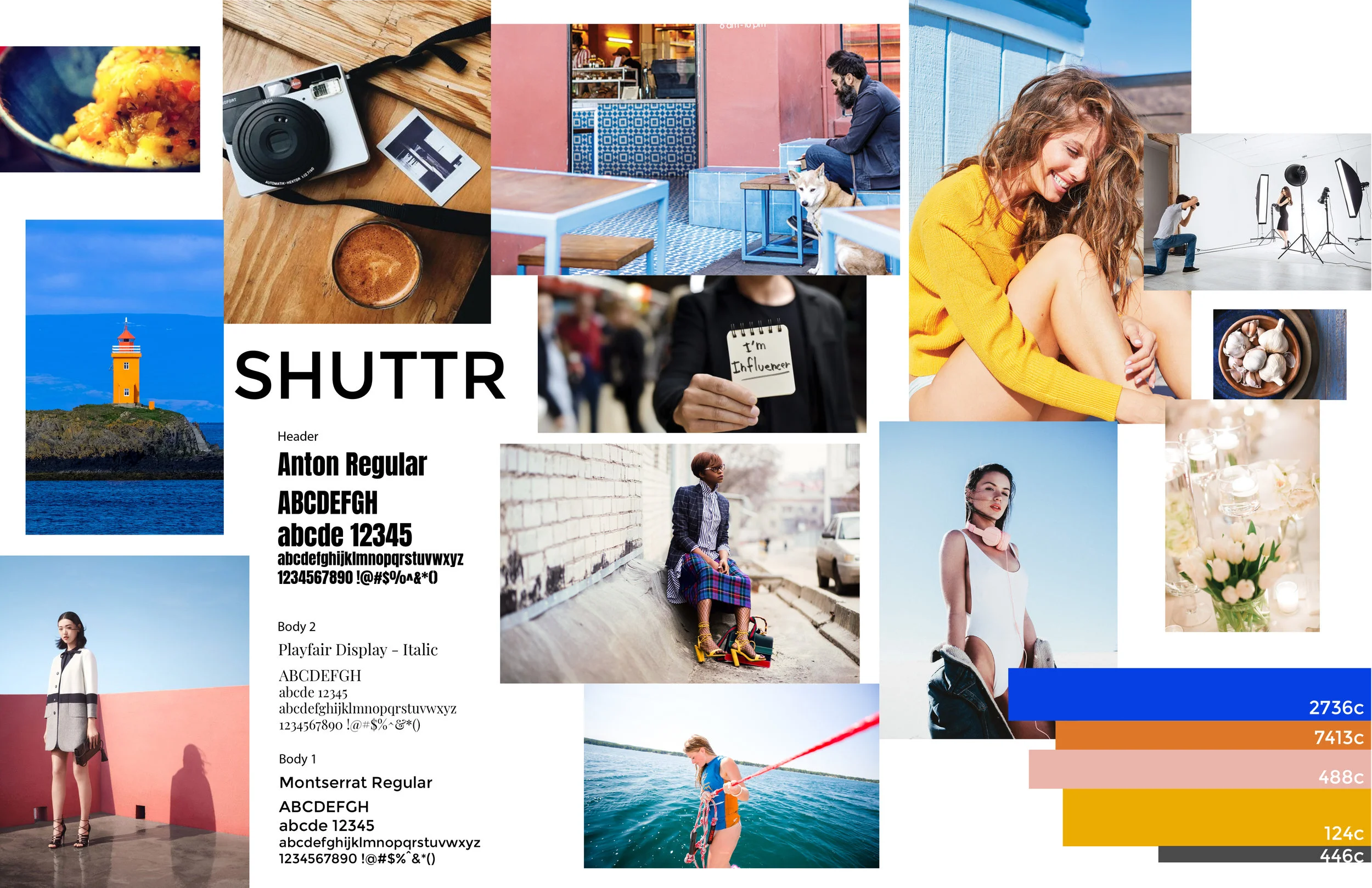
We got inspired by Piet Mondrian’s Neo-Plasticism paintings, which consists of asymmetrical primary color blocks, and thick black horizontal and vertical lines. The use of bold geometric color blocking gives the site a chic and modern fresh look that differentiates Shuttr from all other competitors.
The bright ultramarine blue, yellow, orange, and pale pink color palette are eye catching as users first impression to come to the site.

A particular trouble point our users faced was the booking process.
Users felt the CTA was abrupt and overcommit-all —— they were not sure if they would be charged at that moment they clicked.
We tried multiple different layouts and modals.
Found that simply by changing the wording within the process we could make it more inviting.

We simply shifted the button placement from the left side to the right. This introduced the photographer before asking to continue.
Surprisingly, by making these changes our users were much more comfortable to proceed during usability tests.
Also we made it so that only 40% of the full amount was due up front, the remainder would be paid upon completion of job, which builds trust with the customers.

Introduction of shutter verified ✅(optional for client)
Received over 25 or more 4 stars reviews.
have gone through the shutter application process.
This will create a sense of trust and security within the ecosystem and potential shuttr customer.

With needs in mind, we completed 2 user flows that allowed our personas to come together to complete their common goal of creating compelling content. Chris is on the left uploading his portfolio and receiving notification while Natalie is on the right looking for a photographer in PS for a brand collaboration, as you can see both user flows come together in the middle to meet both users goals.
Mobile Platform
Possible responsive website design on mobile phone proposal.

High-Fidelity Prototype

About the project

Two primary website functions were not on the home page were search and login functions, now there are!
On the original site
Communication took place through a chat form felt impersonal and customers mostly likely wouldn’t expect to get a reply.
A hidden rating system and overly specific location system, the site struggled to create a sense of security.
On the new site
We integrated a new two way chat system that had a more inviting personal feel giving clients the sense that they will hear back sooner with more of a dialogue communication.
With the addition of shutter verified icon, and only the necessary components to bring people together, the website feels like it will create secure trustworthy connections.
Next Steps
further develop the responsive mobile design.
Multiple Portfolios by specialization on freelancers profile
Auto-book function

