
Project Overview
What’s SideChef?
Sidechef is a mobile app that features over 11k recipes, and 255k monthly downloads featuring robust search filtering, meal planning, ingredient delivery, step-by-step guidance with photos, instructional videos, voice command, in-app timers, and smart appliance control; being dubbed the end-to-end cooking platform. Whether you want to save money, eat healthier, or impress your family and friends, Sidechef is here to be your kitchen assistant.

Project: SideChef AppleTV + Mobile Companion App
Client: SideChef
Role: Lead UI Designer
Platform: AppleTV + iPhone
Timeframe: 2 weeks
Tools: Sketch App, Photoshop, Illustrator, Principle, Pen & Paper, Sharpie & Whiteboard, Google Slide

Challenges.

Some of the design hurdles were:
AppleTV remote requires utilization of the microphone button to engage voice feature.
Designing accommodations for both the existing SideChef platform and AppleTV Human Interface Guidelines in mind.
Making necessary information readily available through hands free recipe steps.
Implementing both a voice and touch interface.
Solution.
Add voice command UI to all facets of recipe steps.
A full functionality with voice AND/OR Apple TV remote.
AppleTV app and it’s mobile companion app to function seamlessly around Human Interface Guidelines.
So why Apple TV?
In pursuing this project:
We’re cornering the market as the first cooking guide on the Apple TV platform. For those that do own the tech, we are their only cooking resource.
Expanding information available during the cooking process with an additional display — A companion app.
Allows user to view steps and ingredients at the same time.
Minimizes confusion by showing steps aided by accompanying videos.
Opportunity to build a voice system not dependent on Apple remote.

Research.
Heuristic Evaluation, C&C Analysis, User Persona, Journey Map,
User Observation, User surveys, User Interviews, Contextual Inquiry.


We quickly downloaded SideChef mobile app and began to identify existing problems by exploring functionality, benefits, and pitfalls associated with the cooking process. We then organized the issues we found into a heuristic evaluation chart using LEMERs Methodology.

We then decided to conduct a Competitive and Comparative Analysis with the three leading industry cooking apps — Yummly, Allrecipes and Kitchen Stories.

We began by researching the leading competitors utilizing the same methodology as previously done with SideChef to see what we could learn, more specifically searching for areas where our existing app was excelling or had room to grow.
We found voice navigation, video instructions, multiple ingredient searches, and built-in timers present, but never all in one app.
Survey & Interviews

Some common themes we found across participants were:
88% users cooked at home at least once a week.
66% never spent more than an hour on the task.
It was almost always done alone.
Users often tried to cook with whatever they had available. Something one user referred to as “solving a fridge puzzle”.
94% used a phone or computer to find recipes prior to cooking.
User Persona
We portrayed a user persona that represents the users frustrations and needs based on findings of our previous research. This persona helped guide us throughout our design process by keeping the focus on the average user, instead of general bias towards cooking and cooking related applications.

Meet Clarice…
She is a 30 year-old millennial, working professional with a very busy schedule in advertising.
She lives alone and cooks dinner a couple times a week. She loves exploring and trying out new recipes, but she doesn’t have all night, so she usually allocates an hour maximum to preparing a meal. Most of the time she decides what to cook mostly off whatever she has in the fridge to avoid frequent runs to the grocery store.
Journey Map

Now that we developed our persona, we created a journey map for Clarice to help guide us through some frustrations while using the app. With this information we discovered some of the users pain points:
She needs to continually use her phone to scroll through recipe steps. search out details not mentioned in recipe.
Start/stop timer in the middle of cooking.
Constantly has to clean hands to access her phone.
All this while trying do the ACTUAL cooking!

User Scenario
Clarice just got home from a long day at the office.
How can we help her make an exciting dinner quickly, with what’s already in the fridge, without cutting into her nightly “me” time?
2. Synthesis.
Design Studio, Feature Prioritization, Usability Tests.

Affinity Map

After we gathered results from online survey with notes taken from user interviews, we performed an affinity map to further organize, and visualize users pain points and needs. Some of the main issues users mentioned are listed below:
Can’t search for multiple ingredients at once.
Cooking time is inaccurate. Users always ended up spending way more time cooking than described.
Need multiple timers on certain dishes, but confused with which timer is for what.
Design Studio
We conducted 2 design studios to determine the looks of the interfaces.
The first one was to decide the look of the landing page, which occurred at the beginning of the design process, before we implemented paper sketches. During the design studio, we each initially generated 6 rough ideas; narrowing them down to one after a several rounds of sharing ideas and feedback.

Frank and I discussing icon placement.

Frank giving feedbacks on my sketches.
Our second design studio was performed simultaneously with designing the Mid-fidelity AppleTV app. We realized a built-in companion app within the existing mobile app is necessary to accommodate the AppleTv app in order to function seamlessly. With simplistic functionality in mind, we quickly began sketching out some ideas.

Tucker explaining his though process during 5 mins individual discussion.

My sketches.
Our team members collectively worked-off each other’s ideas to create the final versions of them both. Ultimately finalizing the sketches into our Mid-fidelity prototype.
Features Prioritization

We used MoSCoW method to further determine what features must go into the MVP, and what features could be developed into the next steps.
3. Prototype.
Style Guide, Paper Prototype, Mid-fidelity Prototype, High-Fidelity Prototype.

Style Guide

We modeled our overall theme with SideChef’s existing mobile app branding in mind, while taking some creative liberties along the way.
Food and cookware are both organic shapes in nature. So I designed the visual elements to be more geometric and graphic in order to create contrast with that natural pattern.
We created a complete primary color palette by adding Yellow and Blue with consideration to most foods being comprised of warmer colors.

For the graphic design,
We wanted to use the sharpness of the stripe chevrons to reference a “S ” shape that represent SideChef.
Paper Prototype

We began with quick, rough sketches to test the appeal and navigation of different designs.
By drawing out our low-fi prototype, we got a good scope of the user flow, additionally, from reviewing recorded usability tests, we found that users were struggling with:
Some of the icons were unclear or redundant.
Placing global navigation icons vertically blocked the way of other content.
Layout in the recipe overview didn’t follow HIG. It was impossible to scroll through content horizontally using the AppleTV remote.
Social media share buttons were unnecessary on the end page, the TV doesn’t have social media connectivity.
Mid-Fidelity Prototype
Apple TV app

We then brought our paper sketches into Sketch to produce more detailed mid-fidelity prototypes.
This is where we introduced and tested some design solutions around Apple TV Human Interface Guidelines such as:
Fixed the global navigation icons to be placed horizontally, and reduced to only Menu and Search.
Dropped Search onboard bubble by adding in a search page with HIG keyboard and voice activation feature.
Font sizes adjusted to Apple design pattern.
Redesigned How-to video icon.

Once we had the general layout of the TV app completed, we began work on it’s mobile companion.
It only does a few simple tasks, but they’re tasks that Apple TV and its remote cannot do currently.
Such as:
Portability - User can leave the kitchen with the phone while the timer is set - allowing them to do things like laundry or check the mail
Convenience - Hands free communication to the appleTV app.
Sense of community - Take photos and share thoughts within the app.
Engage with other media - Plug in your headphones to listen to music or podcasts without the sound interfering with the microphone or voice component.
High-Fidelity Prototype
First, let’s take a sneak peak of some of the features within the app.
AppleTV App

Log in to landing page > Open menu bar

Search > Voice command search by “Chicken, Cheese and Tomato“
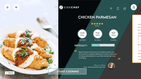
Recipe Overview > Scroll through content or “start cooking”.

Scroll down to view featured items.

Voice input ingredients brings user to recipe result page.

Voice command activation onboard pops up once hit “start cooking”.
Companion App


In a perfect world, both of the apps should have built-in voice virtual assistant (Siri) as users go through the process. Unfortunately, we couldn’t achieve it given the tight time constraints. However, our team acted it out during presentation, because we still wanted to provide our users and stakeholders the complete experience.

Prototype Videos

Apple TV App
Mobile Companion App
Next Steps.
There is always room for improvement. Our project opens up a brand-new voice command concept for AppleTV HIG, as well as opening possibilities for users to interact with technologies in order to benefit people’s lives. We would love to further our design through further iterations, researche and usability testings.
A few things we wished could have been done with technical supports, or would love to be developed in the future:
Provide a complete hands-free experience the moment user opens the app.
Built-in voice virtual assistant within the app.
Fit more than one step on a screen to allow users to scan the recipe while cooking.
Split screens to allow the user to cook two dishes simultaneously.
Build deeper into other app components.
Integrate Google’s new “Cocktail Party Effect” voice AI to free up background noise interference.
